Tools
Form Flow
Form validation, done right, can improve the form filling experience, and user satisfaction
Form Validation
Don’t disable the submit button
Think of forms as a conversation with the user. The submit button is a tool for users to test their answers, and get further help.
Clicking submit is the equivalent of the user asking the form “I believe my form is complete; do you think it’s ready?.” That’s when we step in with helpful error messages to guide the user through any adjustments needed.
When the submit button isn’t clickable, the user is blocked from asking the form what is wrong. They are stranded without guidance on how to proceed. If you notice tooltips being added to disabled buttons to explain why they’re disabled, it’s a clear indicator that there’s room for a more effective approach.
Read more: Disabled Buttons Suck
Add User
Do
The submit button is always enabled, allowing users to “ask the form” and receive helpful error messages at the exact spots that need adjusting.
Add User
Do
The submit button is always enabled, allowing users to “ask the form” and receive helpful error messages at the exact spots that need adjusting.
Add User
Don't
Disabled button prevents users from “asking the form” if their answers are sufficient. Users are left alone to figure out what is wrong.
This problems persist, even when in combination with tooltips. The error message is a bit too hidden, and far too removed from the question that originates the error. This approach doesn’t scale well for multiple errors, and the hover effect doesn’t work on touch devices.
Validate traditional forms only on submit
Don’t show error messages while the user has only partially completed the form or is in the process of answering the questions. Wait until the user submits the form.
When an error message pops in and out as the user types, it breaks their concentration, takes them out of the “answering” mental mode, and throws them into a “problem resolution” mode. That context switching slows them down, increasing the time it takes to complete the form.
Besides, dynamic validation can make users feel as if we’re accusing them of doing something wrong before they’ve finished entering the values.
However, fields may be validated in realtime when their values are used to update content elsewhere on the page in realtime rather than make changes to persistent data. For example, a live chart may contain a date picker and no submit button. If an unusable value is entered into the date picker it is acceptable to display an error message on blur. This should also be accompanied by putting the live chart into an error state.
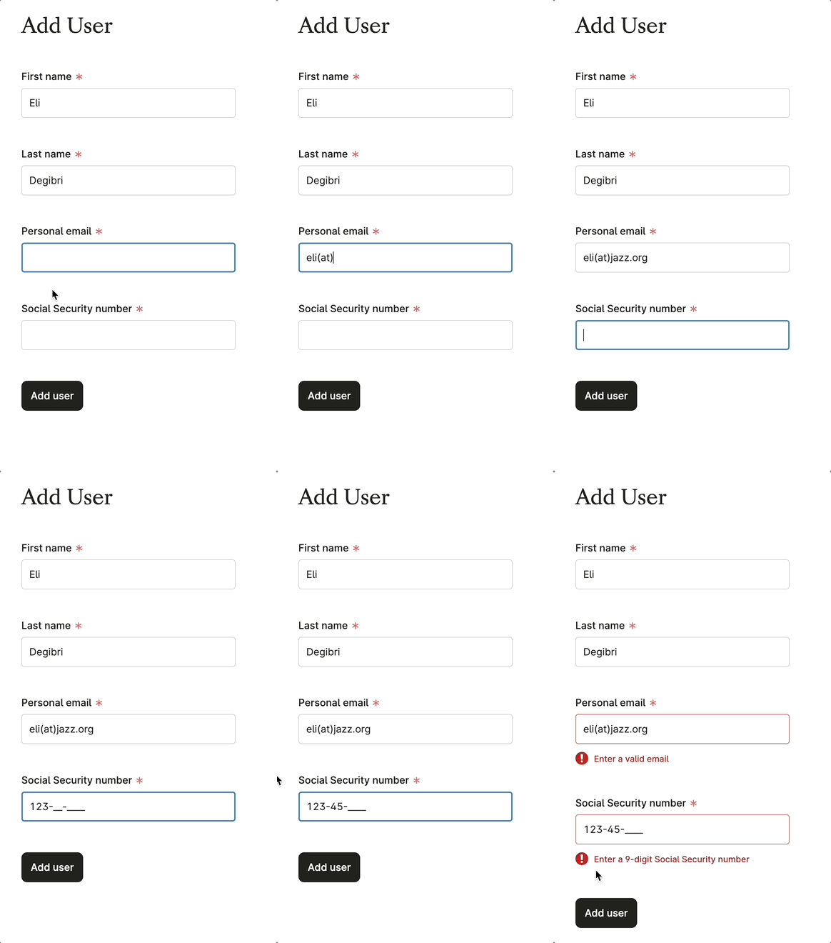
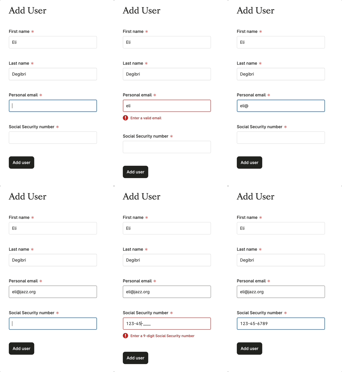
Do
Only validate when users submit the form. Separating the answering from the error correction mental modes allows users to focus on one activity at a time, creating a better experience.
Don't
Don’t validate the form dynamically. It forces users to context switch, increases the cognitive burden, slows down form completion, and can frustrate users.

Do
Only validate when users submit the form. Separating the answering from the error correction mental modes allows users to focus on one activity at a time, creating a better experience.

Don't
Don’t validate the form dynamically. It forces users to context switch, increases the cognitive burden, slows down form completion, and can frustrate users.
Validate on each step of a multi-step form
Validating each step of a multi-step form ensures accurate data capture and a great user experience. By the final step, users should feel confident in completing the form without needing to backtrack for corrections.
Write actionable error messages
Error messages should tell the user what went wrong, where exactly, and how to solve it. Start with what a user should do to correct the issue.
A user must be able to know what to do from an error message, not just that there is an error.
Do
This error message is action-oriented and tells the user how to fix the issue.
Do
This error message is action-oriented and tells the user how to fix the issue.
Don't
This error message brings no new benefit to the user.
Don't
This error message brings no new benefit to the user.
Place error messages as close as possible to their source
1. A required question goes unanswered, or an answer needs adjusting
Show an error message right at the question level using the error option of the Field component.
Add User
Do
Having question and error message immediately next to each other helps guide users’ eyes directly to where the problem is, in a visual and intuitive way
Add User
Do
Having question and error message immediately next to each other helps guide users’ eyes directly to where the problem is, in a visual and intuitive way
Add User
Don't
Don’t use a Banner for errors that relate to specific questions in the form. Here, the error message is too far away from the question that originates it. The user has the additional burden of figuring out where the error is coming from.
Add User
Don't
Don’t use a Banner for errors that relate to specific questions in the form. Here, the error message is too far away from the question that originates it. The user has the additional burden of figuring out where the error is coming from.
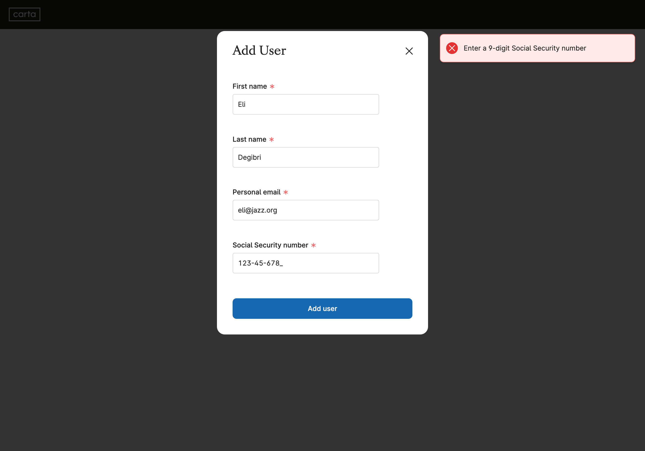
Don't
Don’t use Alert for error messages that relate to specific questions in the form. Alerts are shown outside the user’s field of view, far from the source of the error, and fade away quickly.
Users are left to find the source of the error by themselves, and that burden adds up to a less intuitive and potentially frustrating experience.
2. The error is not in any one answer, but in the relationship between them
Group the related questions in a section using the NewFormSection component. Then bubble up the error message to that section level using the NewFormSection.Error sub-component.
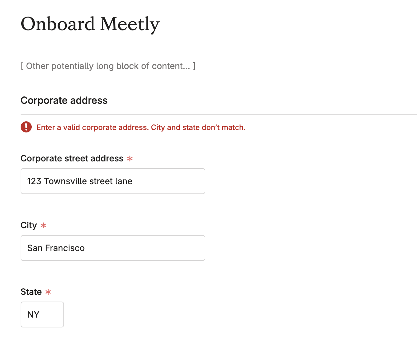
Do
Individually, answers to both City and State questions are correct. The problem is in the relationship between them. In cases like this, bubble the error message up to the form section level.

Do
Individually, answers to both City and State questions are correct. The problem is in the relationship between them. In cases like this, bubble the error message up to the form section level.
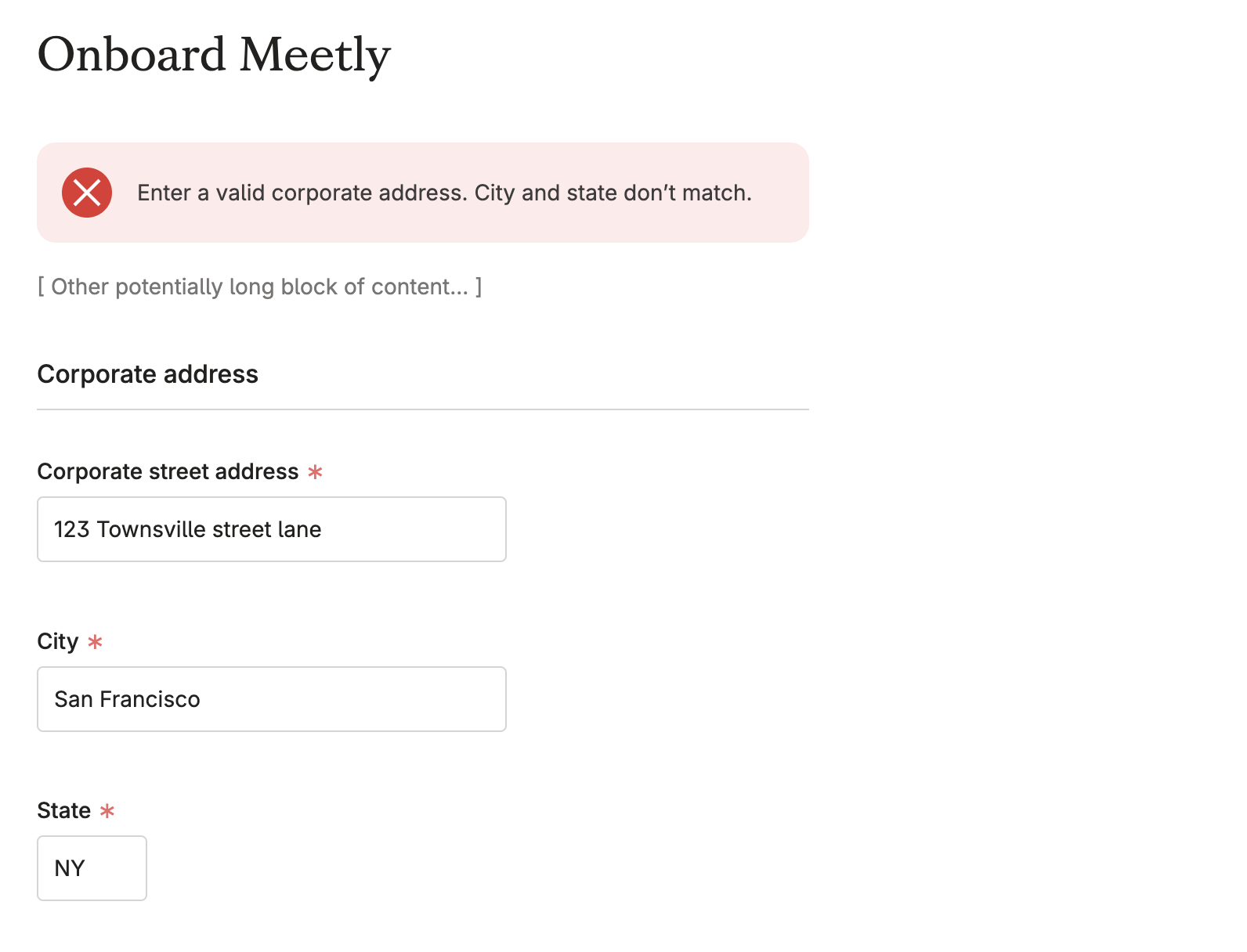
Don't
Don’t place the error message above the form if it relates to a specific section within the form. Instead, show the error message at the specific section level, using the NewFormSection component. In this example, the error might end up being too far removed from its source.

Don't
Don’t place the error message above the form if it relates to a specific section within the form. Instead, show the error message at the specific section level, using the NewFormSection component. In this example, the error might end up being too far removed from its source.
3. The error relates to something beyond the questions and answers in the form
Place the error message at the top of the page using a Banner component of type error.
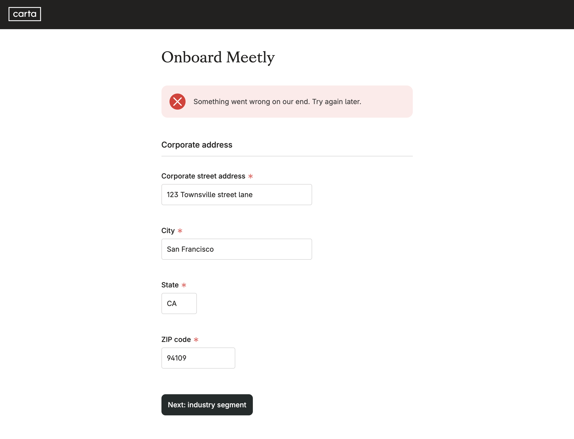
Do
If the error is related to something other than the answers provided by the user, show an error banner at the top of the page after form submission.

Do
If the error is related to something other than the answers provided by the user, show an error banner at the top of the page after form submission.
Scroll users to top-most error
Help the user resolve errors quickly and intuitively by scrolling them to the top-most error on form submission.
Scrolling to where errors are orients them, and creates a seamless and intuitive experience. It also sets them up nicely to fix multiple errors in the same top-to-bottom sequence they just went through. Scrolling users to the very top of the page is not enough. Scrolling users to the top-most error instead is the ideal. The top-most error might very well be half way through the form, or at the very bottom of the page.
To scroll users to the top-most error, enable the errorAutoScroll option on the ink Form component that wraps your form. Once enabled, the page will automatically scroll to the top-most question in the form with an error message in it, when the user submits the form.
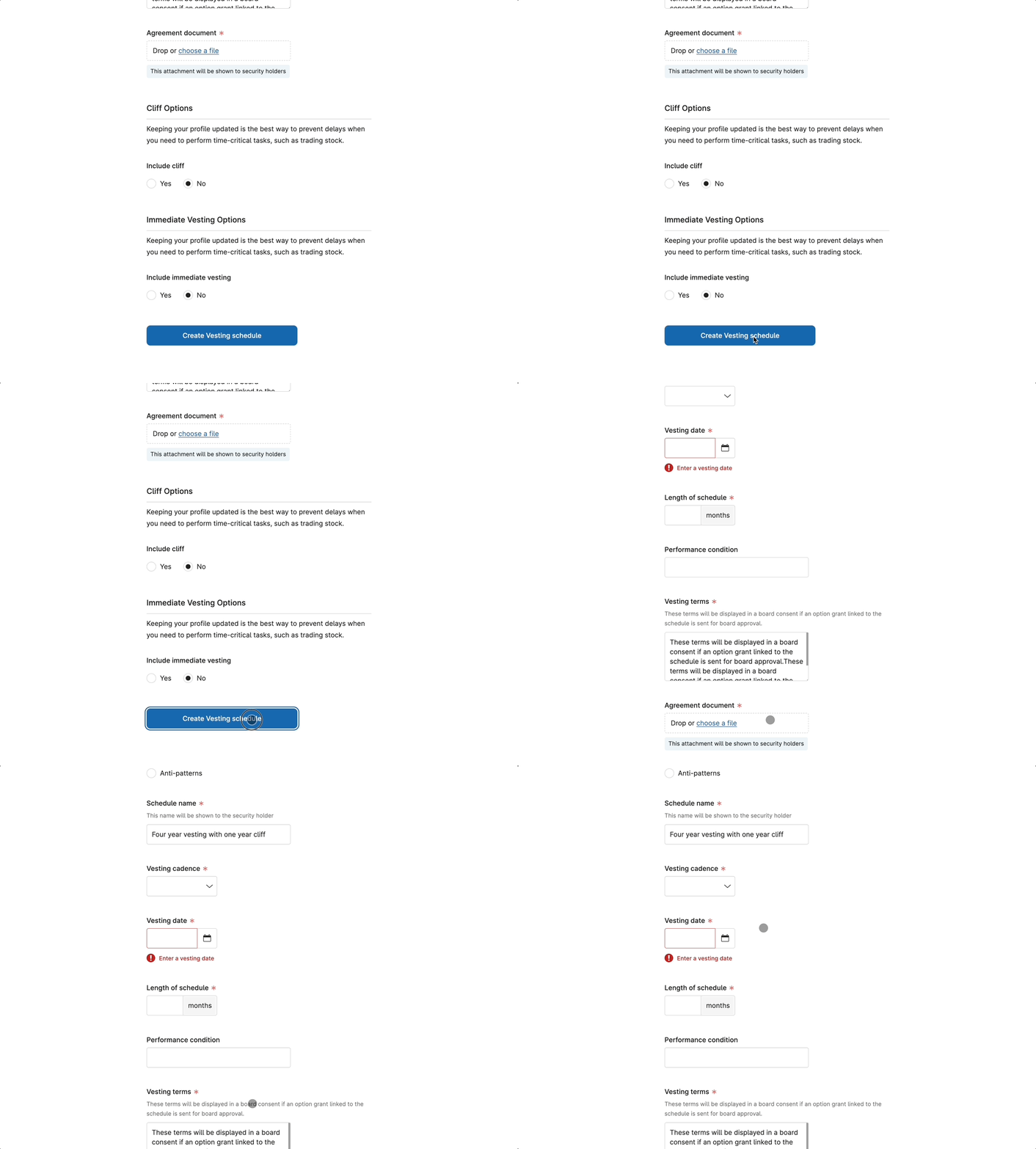
Do
Pressing on the submit button should scroll the user to where the top-most error is

Do
Pressing on the submit button should scroll the user to where the top-most error is
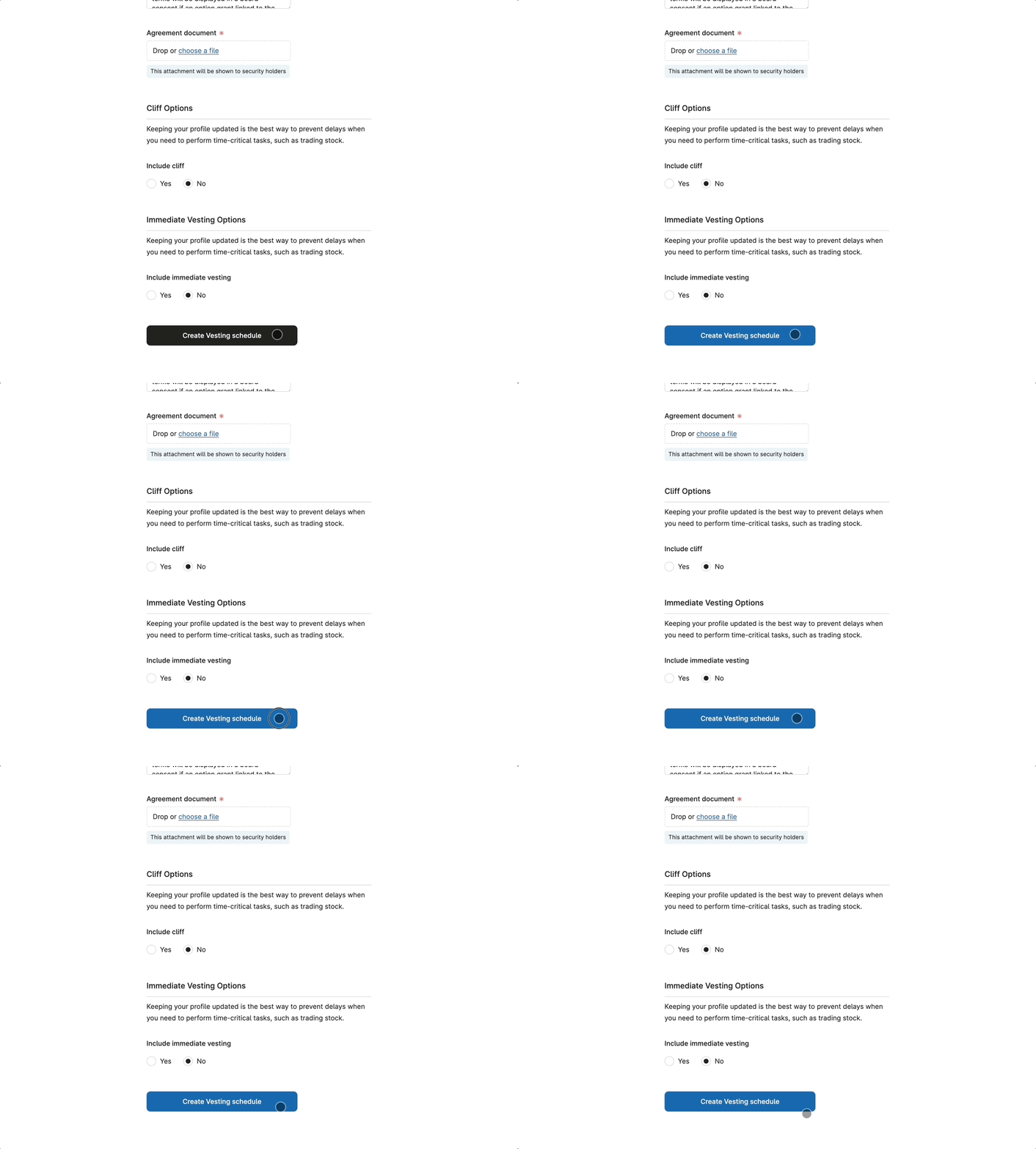
Don't
Don’t ignore the unhappy path, and leave users to figure out errors by themselves. Not scrolling the user to where the error is results in a broken and frustrating experience.

Don't
Don’t ignore the unhappy path, and leave users to figure out errors by themselves. Not scrolling the user to where the error is results in a broken and frustrating experience.
Disable the submit button while processing
By disabling the submit button during processing, we prevent users from accidentally sending the form more than once. This also safeguards Carta from any negative impacts that could arise from duplicate submissions.
The visual feedback from the “processing” state reassures users, and makes the experience more fluid and intuitive.
To show the loading state while Carta processes the answers the user just submitted, use the isLoading option available on both Button and Modal.Footer components.
Note: the few seconds of loading time are one of the rare cases in which a disabled button plays a helpful role.
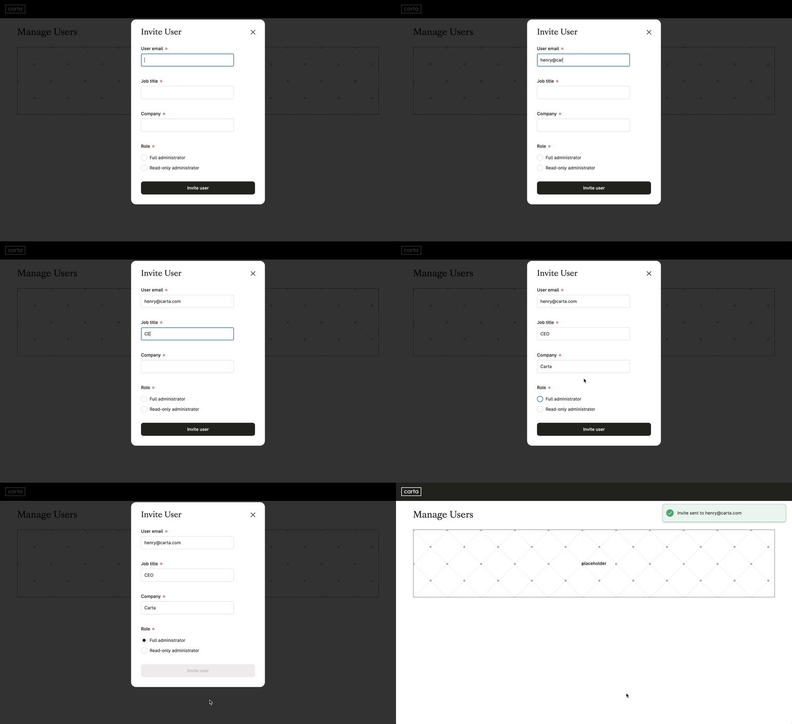
Do
The buttom deactivates as soon as the form is submitted, for as long as it takes to process the request. This visual feedback reassures the user.

Do
The buttom deactivates as soon as the form is submitted, for as long as it takes to process the request. This visual feedback reassures the user.
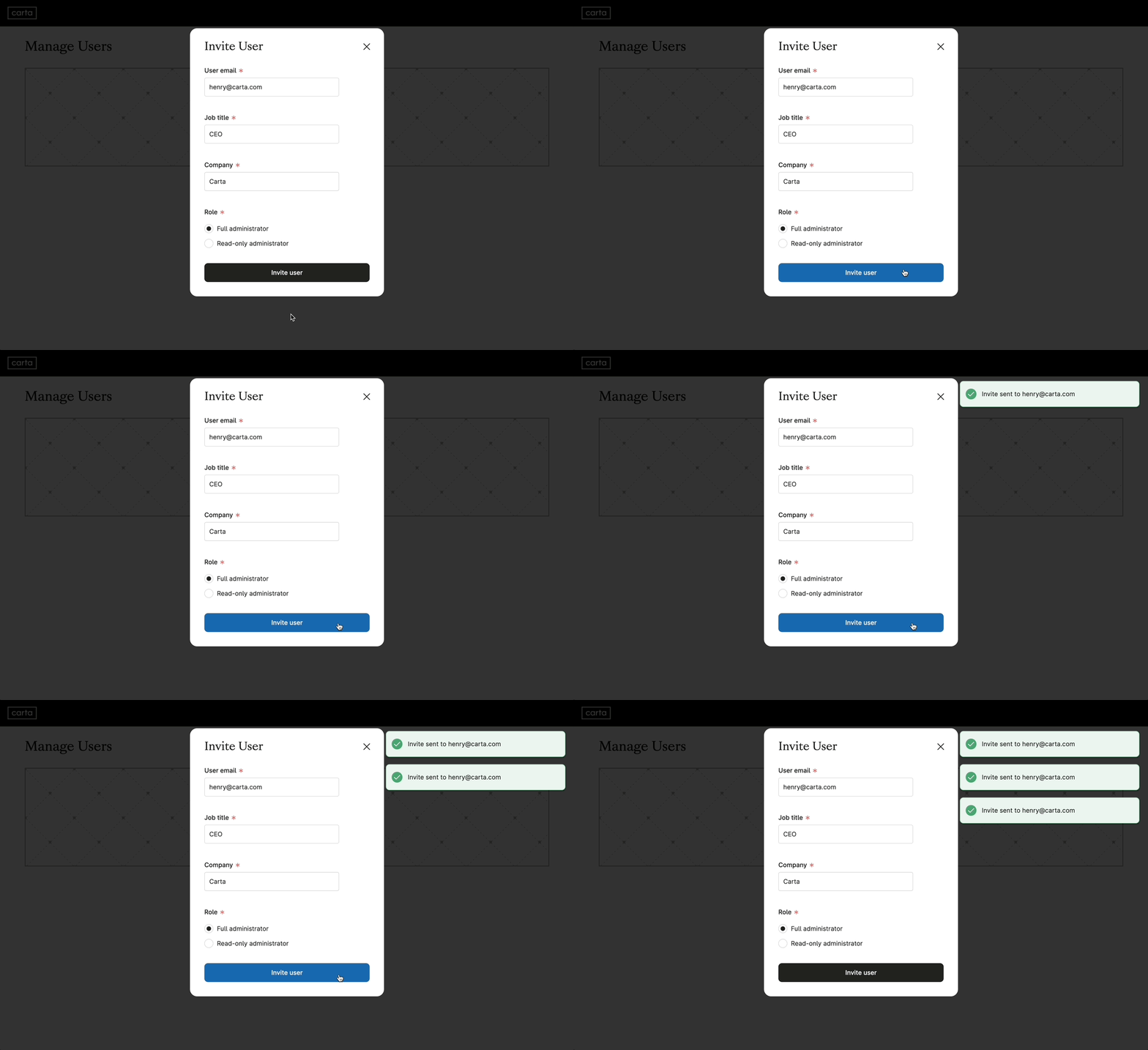
Don't
Don’t leave the processing state untreated, as it may lead users to think their initial submission did not go through. Or may lead to accidental multiple submissions.

Don't
Don’t leave the processing state untreated, as it may lead users to think their initial submission did not go through. Or may lead to accidental multiple submissions.
Address Forms
How to utilize the AddressAutocomplete component from the @carta/identity team
View patternForm UX Writing
Forms are text interfaces. Writing good questions, help text, and actionable error messages is the single most important thing you can do to create great forms.
View patternForm Layout
Layout, type hierarchy, and color, impact legibility, usability, and completion metrics
View patternTable of Contents
Is this page helpful?