Charts
Last Updated: Jan 12, 2026
Guide for creating effective data visualizations with charts
"Bad data + good visualization = bad chart"
— Dona M. Wong1
- Avoid charts if the data set isn't rich. If a short table gives users the same insight, consider skipping the visualization altogether.
- Avoid replacing tables with charts. Charts are an addition, not a replacement.
- Avoid donut charts. They distort data and affect comprehension. Use percentage stacked bar charts instead.
- Avoid letting graphics cloud the message. Remove the noise2.
- Avoid complex interactive charts. Keep it simple.
- Good visualization is like good storytelling. It requires iteration, review, and editing.
- Avoid charts for "users to explore," or other vague goals3.
- Don't let users do the work. Draw out the insights for them4.
Tables
Structured and organized, tables align data in a predictable and glanceable way. They help users navigate through rich data, and shouldn't be underestimated.
| Share class | Fully diluted | Cash raised |
|---|---|---|
| Common | 4,157,157 | AUD 1,175,288.84 |
| Series Seed Preferred | 1,422,435 | AUD 583,379.57 |
| Total | 5,579,592 | AUD 1,758,668.41 |
Progress bars
Compact and convenient, progress bars make information glanceable, without getting in the way. They are ideal for completion and depletion rates, and can be used inside table rows to add visual power to the data, e.g. the Equity Awards ledger progress bar
Capital Call Status
- Received: $2,000,001.00
- Committed total: $11,817,661.00
| Employee | Equity comp | Original quantity | Vesting | Total exercises |
|---|---|---|---|---|
| Tagg Palmer | Plenty to vest | 2,078,056 | CAD 1,100.84 | |
| Mary Steward | Equity refresh due | 4,157,157 | CAD 24,705.20 |
Line charts
Dense and high-resolution, line charts pack a lot of data in little space, and show small changes clearly. They are ideal for trends, high frequency numbers, percentage rates, e.g. stock price, inflation numbers
Vertical bar charts
Ideal for discrete quantities, e.g. number of shares, number of employees, quarterly revenue
Horizontal bar charts
Ideal for discrete quantities with few data points, or long labels, e.g. 2022 revenue for companies A and B
Stacked bar charts
Ideal for showing breakdown, or ratios, over time in an accurate, compact, and easy to compare way, e.g. revenue breakdown by product line per quarter, employee breakdown by department per year.
Horizontal stacked bar charts
Ideal for showing ratios, as described above, inline with other content, e.g. shareholder breakdown by relationship type
Research
- Get data from authoritative sources (rich content gives meaning)
- Review data with product and engineering, to understand its biases and gaps
Edit
Plot
- Choose the right chart type, e.g. a line to show trend, or a bar chart for discrete quantities
- Configure your chart well, e.g. scale, increments, labels, baseline
- Label the chart, e.g. title, short description, legends (when required)
Review
- Check the chart with real data (demo data is deceiving)
- Use judgment to evaluate if chart makes sense
- Look at the chart from the user's perspective
- Refer to Dona M. Wong's book for in-depth guidance1
"Clearly state what you want the reader to take away from looking at a chart"
— Vrushali Paunikar, Presenting Insights4
Carta is a math platform
Users send us numbers and we sell the summation and interpretation back to them5, e.g. extract net new ARR from raw revenue numbers
Charts are one way to do the math for the user
Plotting raw numbers only goes so far. Editing and doing the math on raw numbers allows you to create more interesting data narratives, e.g. a dedicated chart for net new ARR, in addition to raw revenue.
Partner with a subject matter expert
Collaborate with a colleague who has deep knowledge of the data set at hand, to figure out the best way to edit and present it to the user
Understand what numbers the users care about
User research can help narrow down the target. Power users rely on Excel to crunch the numbers. What numbers can we crunch for them ahead of time? E.g. CEOs care about quarter-over-quarter revenue trends. We can infer that from raw revenue numbers ahead of time.
Aim for high data-density
Don't underestimate your audience. Well made charts can handle a lot of data, and still let it flow gracefully to users
"No one can write decently who is distrustful of the reader's intelligence, or whose attitude is patronizing."
— William Strunk, Jr., and E. B. White, The Elements of Style2
Don't make a large chart for short data sets
Use economy of screen real estate as a constraint to keep your chart eloquent
Donut charts are low data-density
Donut charts sell. However, they should be avoided when possible since they are blunt, imprecise, and visually disorganized. E.g. ownership percentage for employees
Small charts can be powerful
Don't underestimate small charts. When content rich, and well crafted, they can be a good fit for the job, e.g. CTC salary and equity distribution
Consider multiple simple charts, instead of a single complex one
Unless crucial for direct comparison, split separate sets of data into their own charts. Even related information can be clearer if presented separately, e.g. cash raised and post-money valuation
"Graphics reveal data"
— Edward Tufte, The Visual Display of Quantitative Information2
If the chart is clean, the user will focus on the content
- Don't use texture patterns or 3D effects
- Check if colors are competing for attention, or creating visual "vibration"
- Check if data labels overlap or clash with each other
- Keep lines to 4 or fewer when using line charts1
Remove noise
- Remove animations
- Remove tooltips unless essential
- Remove legends unless essential
- Reduce number of tick marks and grid lines if possible
- Use colors carefully, economically, in service of the data and the message
- After picking a color for a data point, stick to it for the same data point in that page, or vicinity
- Try different shades of one color, and gray, to create hierarchy in complex cases
Category-based colors
Use category based colors, following the order set in the image below, for free-form color coding of objects.
Colors were chosen based on the contrast among them, and tested against common types of color blindness.
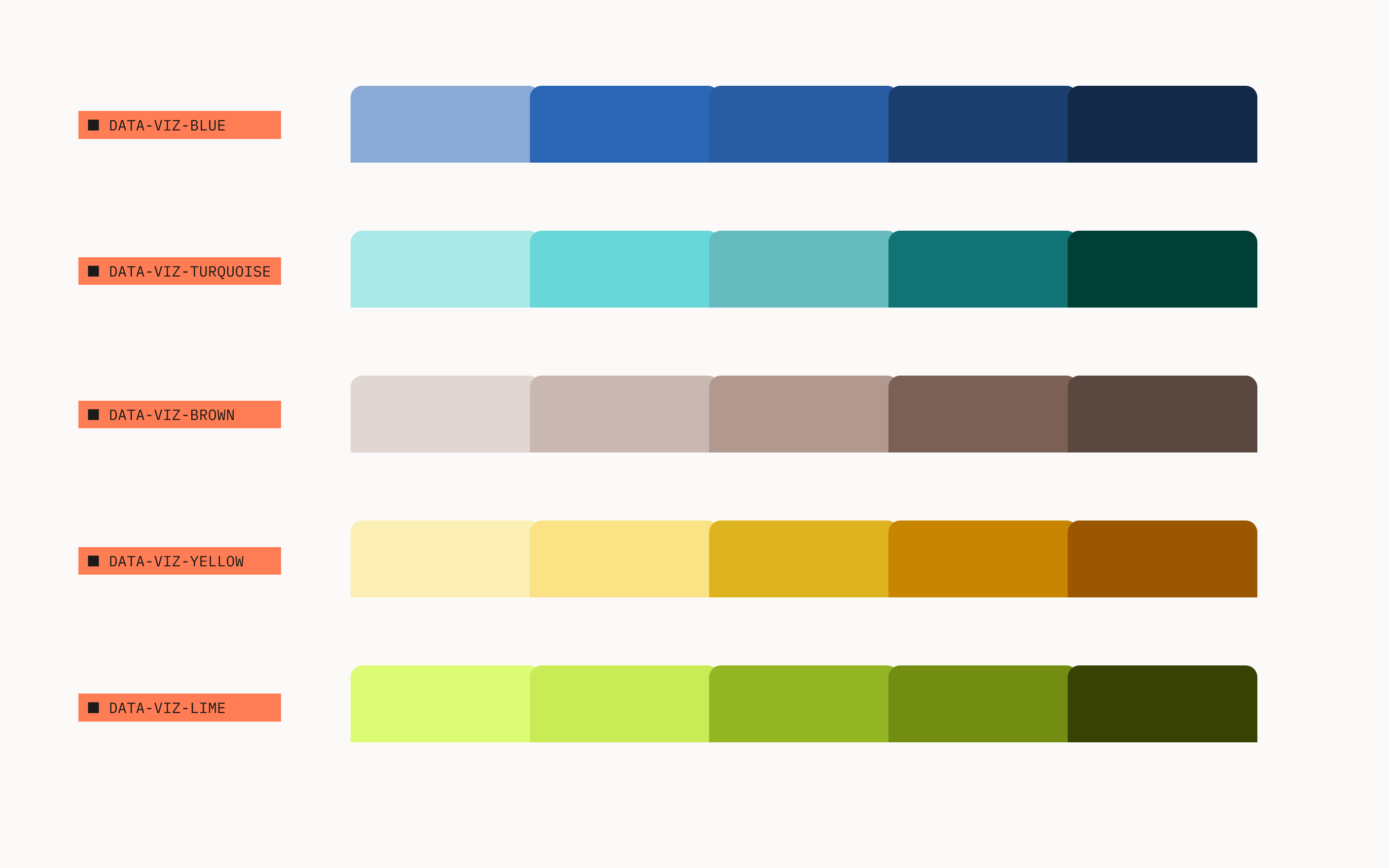
Example 1
Context: Product A wants to add a visualization for employee headcount over time. The first visualization should default to category-1 colors. Subsequent charts for "employee headcount," on the same page or immediate adjacencies, should continue to use the same color coding.
Example 2
When Product A decides to add a second visualization in the same context, the chart should use the next available category color. For example, the following cash balance chart would use category-2 colors.
Semantic-based colors
Use positive and negative colors to help users interpret the data. Rely on neutral colors to deemphasize secondary or supporting data points.
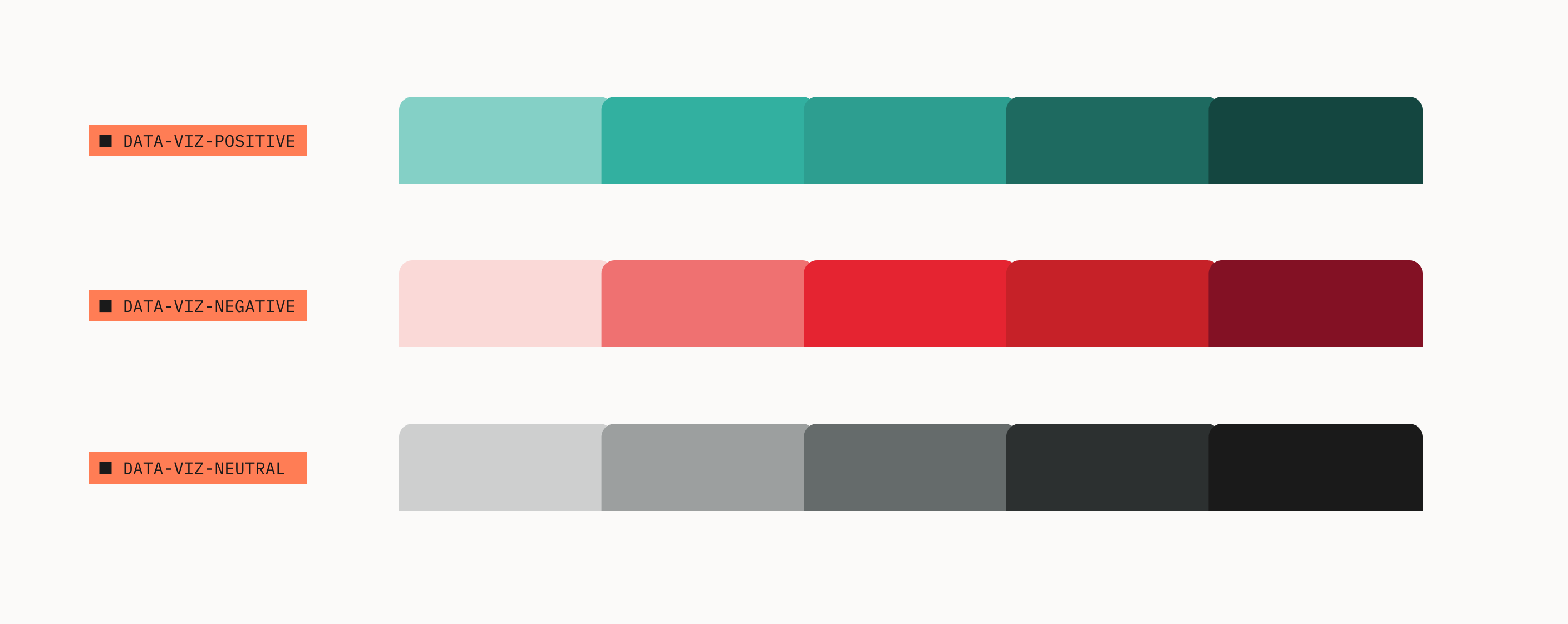
Example 1
How much money a startup burns per month is a key metric. The use of negative color helps convey the threat that burn represents.
Example 2
Use neutral colors to deemphasize secondary data points. That allows key data points to stand out.
Note, line charts don't have to start at y=0, therefore the dark line at the x-axis is absent.
Be succinct while still providing enough context to the audience
- Use the Inter typeface for all chart text
- Don't rotate text as it compromises legibility1
- Stick to plain type, and only emphasize (bold) key elements
- Label the chart and the data directly1
- Avoid abbreviations, unless familiar to users
- Use Associated Press (AP) date formats:
- Jan., Feb., March, April, May, June, July, Aug., Sept., Oct., Nov., Dec.
- Mon, Tue, Wed, Thu, Fri, Sat, Sun
Round data labels to largest meaningful denomination1
- Use K for thousands, e.g $5K
- Use M for millions, e.g. $5M
- Use B for billions, e.g. $5B
- Use T for trillions, e.g. $1T
- Use minus sign for negative values, e.g. -$200K
- Avoid decimal places on axis labels
yAxis: {
    labels: {
        formatter: function () {
        return new Intl.NumberFormat('en-US', {
          style: 'currency',
          currency: 'USD',
          currencyDisplay:
          'narrowSymbol',
          maximumFractionDigits: 0,
          maximumSignificantDigits: 3,
          roundingPriority: 'auto',
          trailingZeroDisplay: 'stripIfInteger',
          notation: 'compact',
        }).format(Number(this.value));
    }
}
`// -100000 → -$100K`
`// 1000000 → $1M`- Most users expect data values to be on the y-axis and time to be on the x-axis. Break this convention at your peril.
- Remove the y-axis, to reduce noise. Grid lines and y-axis labels are enough
- Use few and intuitive y-axis increments, e.g. 0, $20M, $40M, $60M increments are more intuitive than 0, $12M, $24M, $36M, $48M, $60M1
- Bar charts should always start with y=0
- Use double y-axis sparingly. Try to split into multiple charts.
- Use a black line for y=0
- Don't name the axis if it's clear from context, e.g. remove "Time" or "Date" on the x-axis if tick labels are present
yAxis: {
    plotLines: [
        {
           value: 0, // y=0
           color: '#000',
           width: 1,
           zIndex: 4,
} ]}}Use the following tools to create charts with our design standards, and brand direction. These will ensure cohesion in the user experience across products and features.
Chart Library
Highcharts JS is recommended, with the following configuration:
import { tokens } from '@carta/ink';

{
  chart: {
    animation: false, // removes noise
    height: 320,
    width: 452, // golden ratio (height * (2^(1/2))
    style: {
      fontFamily: tokens.font.global.family.base, // ink token
    },
  },
  // Check ink.carta.com for visualization-specific options
  colors: [
    tokens.color.global.visualization['category-1'].default // ink token
  ],
  credits: {
    enabled: false, // removes noise
  },
  legend: {
    enabled: false, // removes noise
  },
  plotOptions: {
    column: {
      pointPadding: 0.1,
      groupPadding: 0,
      borderWidth: 0,
      maxPointWidth: 45,
    },
    line: {
      lineWidth: 4,
      marker: false, // removes noise
      dataLabels: {
        align: 'left',
        crop: false,
        enabled: true,
        formatter: function() { // one label the end of the line
          const series = this.series;
          if (this.point === series.points[series.points.length - 1]) {
            return series.name;
          }
        },
        overflow: 'allow',
        style: {
          color: tokens.color.global.font.feedback.neutral['intensity-70'].default, // ink token
          textOutline: false, // removes noise
        },
      },
    },
    series: {
      animation: false, // removes noise
      states: {
        hover: {
          enabled: false, // removes noise
        },
      },
    },
  },
  subtitle: {
    align: 'left',
    style: {
      fontSize: tokens.font.global.size.small, // ink token
      color: tokens.color.global.font.feedback.neutral['intensity-70'].default, // ink token
    },
  },
  title: {
    align: 'left',
    margin: 40,
    style: {
      fontSize: tokens.font.global.size.body, // ink token
      fontWeight: tokens.font.global.weight.bold, // ink token
    },
  },
  tooltip: {
    enabled: false, // removes noise
  },
  xAxis: {
    labels: {
      autoRotation: undefined, // Never turn type
      style: {
        color: tokens.color.global.font.hierarchy.body.default,       },
    },
    lineColor: tokens.color.global.border.subtle, // ink token
  },
  yAxis: {
    gridLineColor: tokens.color.global.border.subtle, // ink token
    labels: {
      autoRotation: undefined, // Never turn type
      // Defaults y-axis to currency
      // Set to undefined otherwise
      formatter: function () {
        return new Intl.NumberFormat('en-US', {
          style: 'currency',
          currency: 'USD',
          currencyDisplay:
          'narrowSymbol',
          maximumFractionDigits: 0,
          maximumSignificantDigits: 3,
          roundingPriority: 'auto',
          trailingZeroDisplay: 'stripIfInteger',
          notation: 'compact',
        }).format(Number(this.value));      },
      style: {
        color: tokens.color.global.font.hierarchy.body.default,       },
    },
    plotLines: [
      {
        // dark line @ y=0
        value: 0,
        color: '#000',
        width: 1,
        zIndex: 4,
      },
    ],
    tickAmount: 5,
    tickColor: tokens.color.global.border.subtle, // ink token
    tickWidth: 1,
    tickLength: 0,
    title: {
      align: 'high', // Far end
      margin: 0,
      reserveSpace: false,
      rotation: 0, // Never turn type
      style: {
        color: tokens.color.global.font.feedback.neutral['intensity-70'].default, // ink token
        background: 'white', // protects from grid lines
        padding: '0 4px 4px 6px',
      },
      textAlign: 'left',
      useHTML: true,
      x: 35,
      y: 4,
    },
  },
}
Color Tokens
Here's the full list of visualization-specific color tokens you can import from @carta/ink
import { tokens } from '@carta/ink';

tokens.color.global.visualization.positive.default;
tokens.color.global.visualization.negative.default;
tokens.color.global.visualization.neutral.default;
tokens.color.global.visualization['category-1'].default;
tokens.color.global.visualization['category-2'].default;
`// ... and more (see full list in MDX comments)`1 The WSJ Guide to Information Graphics, by Dona M. Wong Recommended
A student of Edward Tufte, former graphics editor at The New York Times, and The Wall Street Journal, and current VP of Communications at the Federal Reserve Bank of NY, Dona Wong's guide is practical, straightforward, and serious.
2 The Visual Display of Quantitative Information, by Edward Tufte
Edward Tufte, world renowned authority on the topic, walks through the history of data visualizations and builds up his philosophy and methodology to visualize data in the best possible way. It's a difficult read, but is packed with substance, and may change your understanding of what data visualization is all about.
3 Banning Exploration in my Infovis Class, by Prof. Eytan Adar
Fascinating article from our friend Vispan Boocha's data visualization teacher, Prof. Eytan Adar. Dives straight to the point: data visualizations designers typically want to create are not the data visualizations users need. To get it right, designers must deepen their understanding of the data, the user, and their goals.
4 Presenting Insights, by Vrushali Paunikar Recommended
Our very own CPO wrote a fantastic guide focused on how to present R&D insights internally.
5 Max Estes' "Cartesian" data visualization project
Max, one of Carta's founding designers, had a brilliant vision for data visualizations for Carta, which he articulated incredibly well in this deck.
6 UK.GOV Office of National Statistics' chart design guidelines
Excellent resource, found by Asmi Joshi (Design, LLC), with lots of visual examples and dos and don'ts heavily in line with the guidance adopted here.
7 January 2023 catalog of Carta in-app data visualizations
The status quo of the Carta platform, reveals a great variety of charts, and different degrees of sophistication. Some could be removed, some could be refined for 5x more impact, and a handful of them show sophistication.