
v34.1.0
Tools
Page Layout
Standard page layouts are familiar, functional and scalable
Overview
To interactively explore standard page layouts, use ink primer.
Standard page layouts
- Create a sense of familiarity for users as they navigate from one part of Carta to another
- Are highly functional because they are iterated on with feedback from across Carta
- Scale a product from MVP to maturity with quality and coherent design
When to use standard page layout
Use standard page layout most of the time. Standard page layouts cover more than 80% of Carta's page layout needs. Some common page layouts include:
- A page with a page title, a form, and some form controls
- A page with a page title, a table, and some table controls
- A page with sections of mix content (copy, form, table, and etc)
When to use custom page layout
In some cases, custom page layouts are more ideal than standard page layouts.
- Where we make first impression like dashboard and overview pages. These pages tend to have shared ownership by multiple teams.
- Where we strive for lasting impression like data visualization pages with interactive controls
- Where users benefit significantly from an optimized or custom experience that mimic what they're used to outside of Carta
- Better Offer Letter
- Payments Staff Tool
- Auction Market Monitoring Tool
- When we need to immerse customers in celebration or focus:
- full-screen celebration
- full-screen spreadsheet
Common layouts
Standard page layout consists of five page regions: Header, Navigation, Content, Accessory, and Footer. The presence or absence of each region—and how each region is configured affect grid configuration for different screen sizes (Figma reference). The most common grid configurations, in order of complexity, are:
Content only
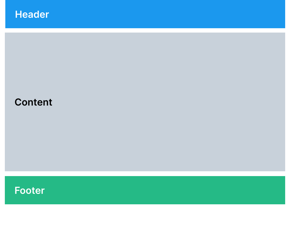
Used to display simple forms or ledgers
Examples include:
Header
Navigation
Content
Accessory
Footer
Navigation
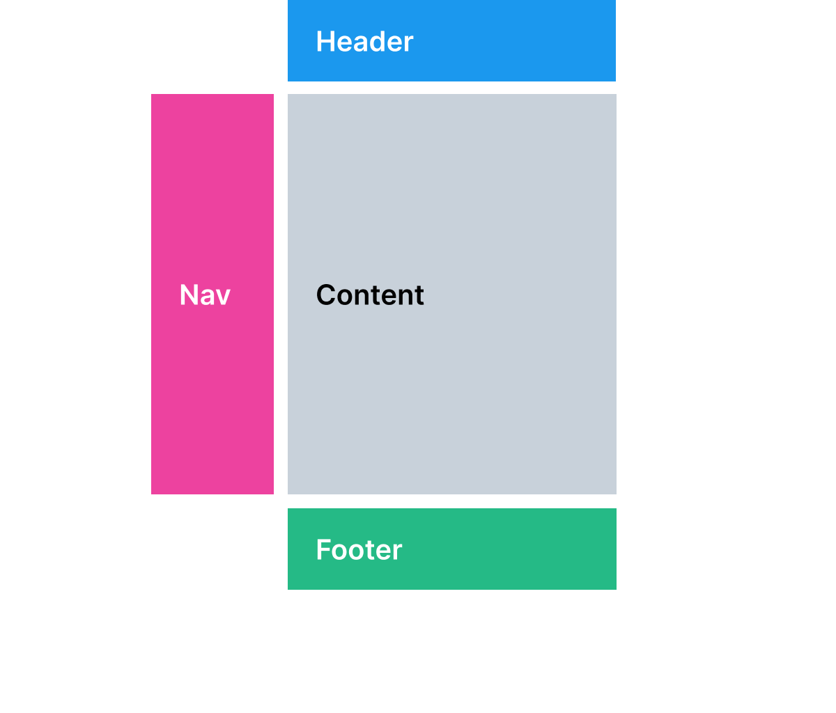
Used for settings pages or stepped workflows
Examples include:
Header
Navigation
Content
Accessory
Footer
Horizontal navigation
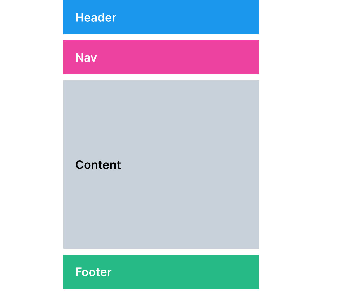
Used for content pages that need horizontal screen real estate
Examples include:
Header
Navigation
Content
Accessory
Footer
Accessory
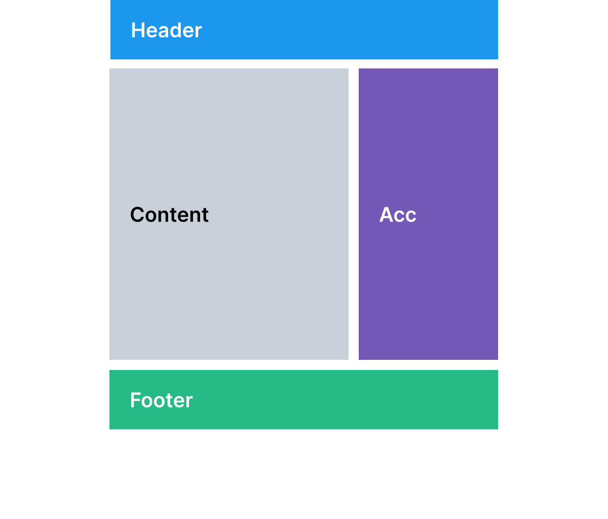
Used for pages with supplemental content
Examples include:
Header
Navigation
Content
Accessory
Footer
Leading accessory
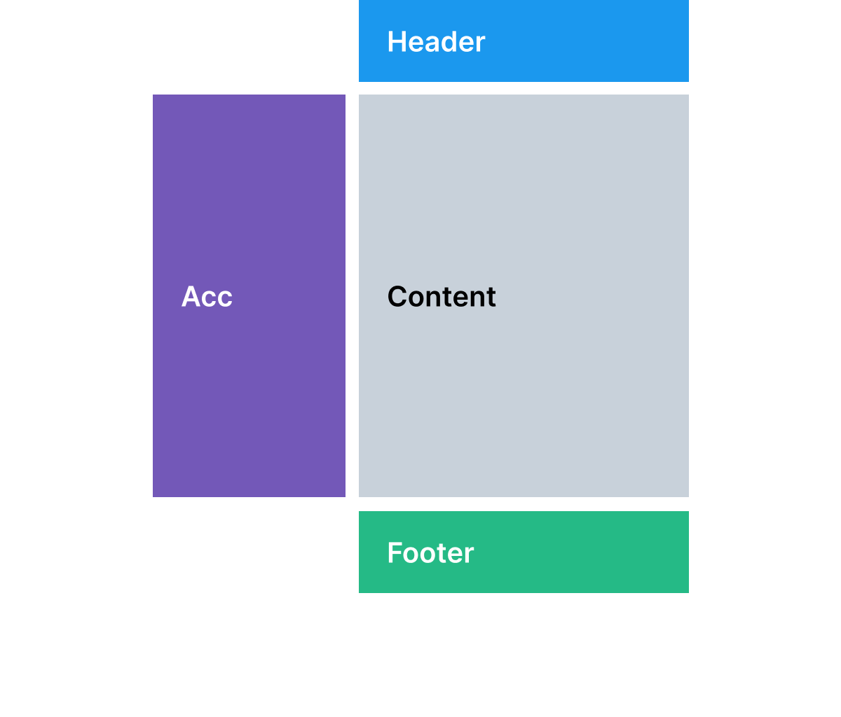
Used for pages with leading supplemental content
Examples include:
Header
Navigation
Content
Accessory
Footer
Navigation and accessory
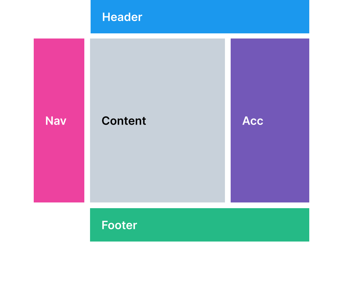
Used for settings pages or stepped workflows with supplemental content
Examples include:
Header
Navigation
Content
Accessory
Footer
Horizontal navigation and accessory
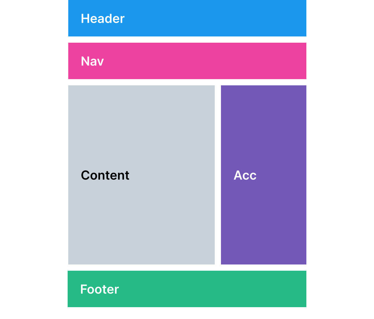
Used for pages with supplemental content that need horizontal screen real estate
Examples include:
Header
Navigation
Content
Accessory
Footer
Horizontal navigation and leading accessory
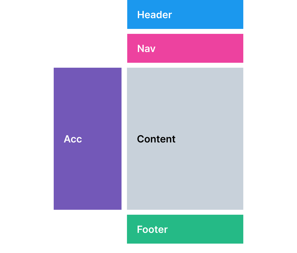
Used for pages with leading supplemental content that need horizontal screen real estate.
Header
Navigation
Content
Accessory
Footer
Is this page helpful?