
v34.1.0
Tools
EmailKit
Carta's email design system
General Layout
All you need to start an email template,
This will import and use the email styles from base.html
Guidelines
Make your emails simple
Email clients suck. They all do. CSS is barely supported—even in clients like Gmail.
This kit was designed to be a simple and well supported on all email platforms.
Content is important
You don't need to be a great writer, our messages just need to be useful and make sense.
The bare minimum I ask of you:
- Make sure you've proofread and understand the content in the email.
- Ask yourself: "If I received this email out of the blue, would I know what it's for?"
Many of our emails fail this test. You can do it!
Design system content requirements
- Always have a header.
- Always have a email body that's not just the button.
Avoid personal details
Email accounts are hacked all the time, don't put too many details in somebody's email inbox. Do not write sensitive personal or economic data in emails.
Stick to text and tables
The design system is limited to only a few simple components in order to ensure compatibility across many different email clients. The system can be extended, but requires a really annoying amount of testing to validate that it works in all email clients. See below for the section on "Extending the email kit".
Inline styles
Don't even think about it.
Placement of elements in the document
In order to consistently apply margins and spacing, elements
- All text must be contained inside of expected block elements
The design system assumes you will be using a paragraph, table, list, button, or header to contain all text.
Do not write bare text in the body of the email. Use a paragraph tag. If you see red around the text in your email while previewing. This indicates bare text.
Do not nest margin elements. ~~<p><p></p></p>~~
Plain text emails
Some emails sent form Carta do not use the design system and are rendered as plain text. These are not broken and are used for special cases.
Spacing and sizing
The email design system uses a grid based on 8px.
This doesn't always work out, especially on mobile when sizes need to be reduced. Target using the 8px system.
Large space = 24px;
Small space = 16px;
Components
Button
I'm starting with buttons because they're complicated—It gets easier.
Due to compatibility issues buttons must used with the button.html include.
Use {% include 'mailer/includes/button.html' ... %}
Example:

Buttons are the big blue action in most of our system emails.
What makes this so hard?
In some email clients an anchor can't be styled to have padding or a background color. In order to provide action buttons to all clients the button must be included with the arguments of button_text and button_url.
Example:
Button include arguments
All of these accept strings of text or Django variables.
| Name | Description |
|---|---|
button_url | Button url is the complete formatted url to be used. This typically requires concatenation using the render_as Django tag. See below for usage of render_as |
button_text | The text to appear on the button. If the text of your email is dynamically generated in your template, use the render_as Django tag. |
class | To add an additional class to the button element, use the class argument. |
attributes | To add additional html attributes to the button anchor tag. The string is inserted inside the tag at render. |
Button usage
Don't use
›in buttons
That's the little angle right at the end of text links. The button is enough.Use sentence case
Button text should be sentence case.Place at the end of the section
If you have content after the button, place a<hr>after the button.Only one primary button
If you need multiple buttons, we'll need to add another class for secondary button styles. At the time of publication we have no emails with multiple buttons. We did in the past. Maybe you just structure a normal anchor for secondary actions?
The render_as var tag
You must import formatting tags to use: {% load formatting_tags %}
Due to how we use Django templates, we often need to import and use the render_as tag to combine variables into strings.
This takes the content between the two tags {% render_as my_var %} and {% end_render_as %} and renders all contents to a string. Whitespace is stripped from the beginning and end of the content.
Headers
Header is 640x220
how you can use a different image:
Guilloche automatically changes
Confetti header
- Use this very sparingly!
Your PM is wrong and the email does not need confetti. Use only for strong brand moments and not simple confirmation notices.
To enable confetti, add this snippet to the top of body.html
Confetti is not currently supported in Outlook :(
Co-branded header
Places the cobranded logo where the Carta logo typically is and moves the Carta logo to the top right.
To use a co-branded email provide an image url to a cobrand_logo block at the top of body.html.
WARNING: Image out of date. The current cobranded header no longer contains Carta branding.

Not currently supported in Outlook. This is due to the logo image sizes not being consistent.
Email Title
All emails must have a title
This is the large text at the top of an email.
Should be consistent with the email subject and fairly short.
Title
Use <h1>
Reserved for email title only
- Write short headers that are general.
- Avoid excessive variable content in the header.
- Move the details into the body copy.
Large title .large
Use <h1 class="large">
Reserved for special occasions, such as a new grant.
Text must be very short, approximately 4 words or fewer.
Pre-title
Use <h2> before the <h1>
A pre-heading to the title. This is optional flavor text.
Use the pre-title for excitement.
Don't overload it with content.
Don't use it as a subtitle.

Showing Large title with pre-title above.
Paragraph
Block level text container with a margin bottom.
Reminder: Don't write text without a container element. All text must be contained within a semantic context and have a block element parent.
Don't put paragraphs inside of paragraphs.
Don't leave empty paragraphs.
Sections and HRs
I don't mean using the section element, that wouldn't actually work.
A line to divide sections.
Just use an <hr> this is what html is for.

That HR dividing a page followed by an optional <h2> header to start that section.
Tables
Tables are great, use them for everything!
The .table-container div
A table must be wrapped in a <div class="table-container"></div> This provides margin to the bottom of the table.
The container provides margin to the bottom of the table. Due to, (you guessed it!) an outlook bug, margins can't be appleid to tables.
- Use the
.table-containerthis provides margin to the bottom of the table. - Do not nest
.table-containerinside other elements. - You can place elements to immediately follow the table inside the table-container.
- Table styles will not load without the container.
Key-Pair-Table
Display tabular data where the first cell of each column is the header to the row. Only provides two columns. For multiple columns, use a basic table.

Use a .key-pair-table class to enable this layout.
Basic Table
Use a key-pair-table when possible. Multiple column tables with headers don't render well in email or on small screens.
Display tabular data with multiple columns and headers on the top.

Use a .table class on the table element to enable this layout.
Table titles
Use <h3> for table titles before the table container.
See The following grants were split in the example.

H4, and H5 are not allowed. H3 is slightly larger and allows for differentiation from table headers.
Content below the table
Content can be added immediately below the table before the margin. Useful for adding that fine point. The .table-footer class adds a margin-top to the block. See 4 more items were signed or... in the example

Joined row
For some layouts a double height row is needed.
.no-border
Removes border bottom form the row.
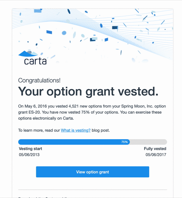
Progress bar
Used to graphically show progress. This is a hack made out of tables to be compatible with lesser email clients. Implementing dynamic visuals compatible with many clients is limited lower your expectations for achieving other graphs. This component offers only one bar.

In the vesting notification we show a progress bars to indicate vesting progresss.
Anchors
Use <a> for anchor elements.
Anchor elements are rendered in $color-blue #1b98ee.
The arrow at the end of a link
Do not use angle brackets or the greater than or less than sign.
Use ›

Use › HTML entity for links that stand alone such as learn more links at the end of a paragraph.
Don't use it for mailto links nor links embedded in sentences.
This is a "single right-pointing angle quotation mark". I call it a "Right Side Angle QUOte" as a way to remember it.
Images
Avoid using images in your emails. The system is intended to be used without images, but exceptions can be made. Images are not reliable without extensive pre-formatting. Only use images with a known dimension where you can specify a height and width.
Logos and partner brand logos
.entity-brand class is used to place logo images in emails. Since they are inconsistent in background and scale: It adds a margin and border to offset it from the content of the email. Note: this should be disabled in outlook if exact sizes can't be provided.
Height and width are required
If you can't provide a height and width, you can't guarantee presentation in the email. In outlook the image will scale to the native dimensions of the image. If you don't know the aspect ratio of your image at the time of templating, there's no way to limit just one dimension without stretching the image. In outlook, if one dimension is provided, the other will default to 100px;
List
We removed decorated lists in this version. Decorative bullets and counters were not supported in many email clients.
⚠️ This section is out of date! The default list style is more condensed than as pictured. There is no spacing between list items in production. Use class "header-list" on the "ul" or "ol" element to add a space below each list item. This should only be used in the case where you are providing headers inside your list items.
Bullet list
use <ul>

Numbered list
Use <ol>

List item headers
Use <h4> inside the <li>
If you would like an optional header for your list item, use an <h4> to keep the font size the same as the list item counters/bullets.

Text blocks
Message block
Used to highlight block of text with. Provides a blue background to offset text from the body. Typically used when somebody "included a message"

Code block
Yellow - monospace, and text center.

Only used for codes, do not use code block to decorate other content.
Traceback block
Not documented yet. This provides a gray background and monospace text. Use this only for internal error emails which contain tracebacks.

Typography Styles
Styles on Headers
- Don't use
<strong>for headers.
The strong element should be used only for making your text bold in cases where the text is semantically not a header.

Heading large
- Reserved for email titles on special occasions such as new awards.
Heading 1
32px, Medium, 40px line height
- Reserved for email titles.
Heading 2
24px, Light, 36px line height
- Use as a pre-header to the header.
- Use as header of a divided section. Cases when you would divide the page with an
<hr>.
Heading 3
18px, Bold, 24px line height
- Use this as a lead in for a table.
Heading 4
16px, Bold, 24px line height
- Use this as a lead in for a paragraph.
- This shares the same size and line height as body copy.
- Similar style used for TH.
Styles on Inline text elements and styles
Body copy
| Screen | Type setting |
|---|---|
| Desktop | 16px, normal, 24px line height |
| Mobile | 14px, normal, 21px line height |
Small text
| Screen | Type setting |
|---|---|
| Desktop | 14px, normal, 21px line height |
| Mobile | 12px, normal, 18px line height |
- This is also the style for the footer text.
- Use
<small>for bold.small - Used to reduce scale of type for deemphasis. This is also the style for footer text.
- When the
.smallclass is applied to a paragraph element, the margin bottom is reduced to12px.
Bold text
- Do not use for headers, use an h3 or h4 element.
- Use
<strong>or.font-bold - Used to apply bold text inline.
Emphasized or italic text
<em>For italics..text-italic
Text colors
Darken is a slate gray with $color-slate #364453
- Use
<span class="darken">or this is the default color. - In addition to the
.darkenclass, this is the text color for all text in thecontentsection of the email.
Lighten is a medium gray with $color-gray-light-3 #686865
- Use
<span class="lighten">for lighter text. - Use lighten for deemphasis, not for decoration.
- In addition to the
.lightenclass, this is the text color for all text in thefootersection of the email.
Anchors are blue with $color-blue #1b98ee
- Anchors are
<a>and you already knew that. - A class does not exist to color text blue.
Right arrow →
- The right arrow is the html entity
→ - This is used to indicate that something has changed. Useful in tabular data when you want to reduce the number of columns.
Centered text
Err on the side of not using centered text. For compatibility and consistency keep text left aligned.
Avoid all-uppercase text
Due to reduced legibility and the fact that you "LOOK LIKE YOUR SCREAMING", do not use all uppercase letters.
Extending the email kit
First of all, please don't. I know your PM is desperate for something to be bigger and red, but modifying emails is technically really hard. It's incredibly important to reduce the scope of what we allow as elements in the email kit to ensure stability.
You solemnly swear to test in outlook
If you modify the email kit you promise me you will test in all major email clients—including Outlook. Litmus.com in an amazing tool for testing.
Outlook
Outlook is one of the most popular email clients in the world and is really common in law firms. We need to ensure our emails don't look broken for these users.
CSS and HTML are not rendered in the same way in Outlook. Microsoft chose to use Microsoft Word as the rendering engine for outlook. As you are aware, Word is not a web browser. Only basic html and css are supported. If you stick to the limited kit in this email it has been tested and is functional in outlook.
Writing Outlook code
If you are desperate to implement something in Outlook, it uses a language called VML.
Targeting code for Outlook
| Show only in Outlook | |
|---|---|
<!--[if mso]> | Start outlook-only code block |
<![endif]--> | End outlook-only code block |
| Hide in Outlook | |
|---|---|
<!--[if !mso]>--> | Start hide in outlook code block |
<!--<![endif]--> | End hide in outlook code block |
Guide to HTML/CSS support in various email clients
- Campaign Monitor - Email Clients - This nifty guide will tell you what properties can be used in various clients.
Things you expect to work but don't
Many features of HTML and CSS do not work in many clients. These often have a workaround, but don't work as expected in many clients.
- Negative margins and padding
- Background images
- Absolute and relative position
- Box shadow
- Border radius
- Media queries, (Poorly supported)
Media queries
Plan on them not working in many clients. We use them for progressive enhancement, but Android mail clients generally don't support them.
- Always use !important on media queries. Our email pipeline automatically adds all non-media query css to each element as an inline style. !important is needed to over-ride the inline styles.
- Android gmail doesn't support them, so expect them only to work on iOS.
How the email system works
Carta uses Django templating to make emails.
Your files
These files are required for your email.
body.htmlsubject.txtsamples.yml
Email context
The context is what python provides to the email template as variables. When being rendered the server passes these data to the template.
Variables are accessed
Imports
These lines typically appear at the top of your body.html. They are used to import extra features used to render your email. Don't add ones that you don't need.
{% load mailer %}
{% load formatting_tags %}
Include this extra formatting and filters, generally used for text manipulation. Such as pluralize
Images
Adding static images bloats the carta-web git repo. Avoid adding new static images.
Extending base.html
Blocks
Stylesheet include
Style pipeline
As far as I can tell, magic does this step. But the css is parsed and applied as inline styles. or as a <style> at the top of the document
media queries are in the style tag. This means they must be applied with !important
Testing emails locally
Images won't work
You can make them load locally, by making this change to
eshares/mailer/templatetags/mailer.py
Emails samples page
Email validation
Email validation shows up when viewing in the email preview to help enforce these standards. Email validation is done by way of CSS queries add a warning over invalid elements.
static/lib/eshares/css/email_validation.scss
Red text shadow
Red text shadow indicates text that is not a child of an element—such as a paragraph. Ensure that email text is contained inside of a paragraph or other element for proper margins.
Table of Contents
Is this page helpful?