Tools
Playroom 101
How to use Playroom for rapid prototyping
Features
We have adapted Playroom for ink to allow us to develop design simultaneously across a variety of screen sizes with our components. We often use this to
- Build prototypes in a collaborative way
- Provide feedback when posting in the #ink channel on Slack
- Share interactive mock ups
- Documenting and testing for bugs
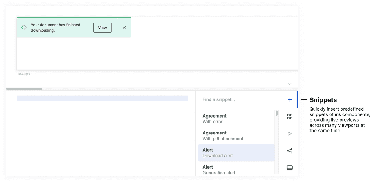
Snippets
Snippets are like templates for our ink components. Most examples we provide in our component documentation are available as a snippet in Playroom so our designers and engineers have a seamless transition.
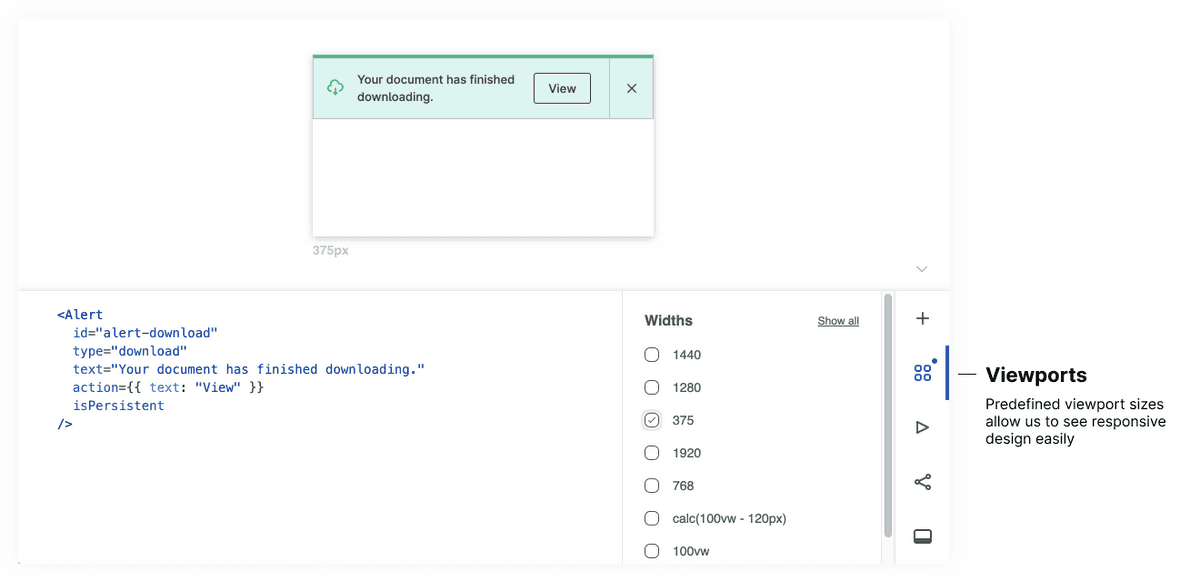
Viewports
We have predefined widths that help us see how our components work depending on design needs and responsive behavior. We have additional documentation on responsive breakpoint patterns.
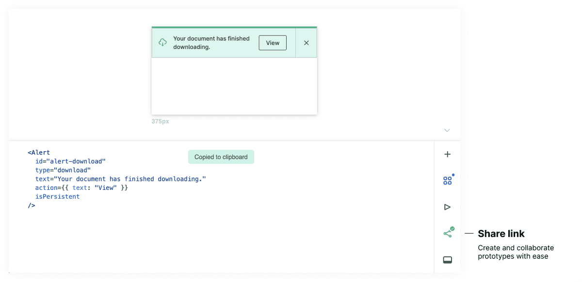
Share prototype links
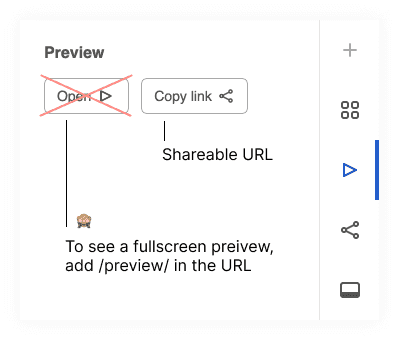
As we add code to playroom, the URL is automatically encoding a Base64-encoded ASCII string which is immediately shareable. Any modifications will generate a new encoded link which shares the modified code. This allows us to copy and share the exact state of a design with our colleagues through slack, email, etc.
Tip: Many of us have our own tricks for sharing extremely long links that far exceed character limits, but some examples include linking text in an email or embedding the url in a shareable google doc.
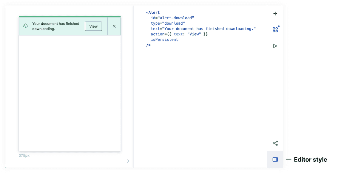
Editor style
By default, the code editor appears on the lower half of the screen but can also be moved to be on the right side.
Fullscreen preview
To get a fullscreen preview of the playroom mock, we have to manually insert /preview/index.html in the shareable URL (for now).
For example, this link —
https://ink.carta.com/playroom/ + index.html + #?code=generated_code_here
↓ becomes
https://ink.carta.com/playroom/ + preview/index.html + #?code=generated_code_here
Code usage
Using state
When we want to use state, we have to use a wrapper around the code as this sudo example:
For a real world example, check out this playroom example using NewCheckbox
Filling space with a placeholder image
We have a component called <Placeholder /> that fills the space of a component when we need to occupy space. Check out this playroom example showing different types of Placeholder usages.
Formatting
Pressing cmd + s (or the equivalent on windows) will format the code neatly. Code can also be folded
Undo
As with many editors, cmd + z (or the equivalent on windows) is possible to undo your last change.
Autocomplete properties
Valid ink code will offer a list of available props like a code editor would.
Related
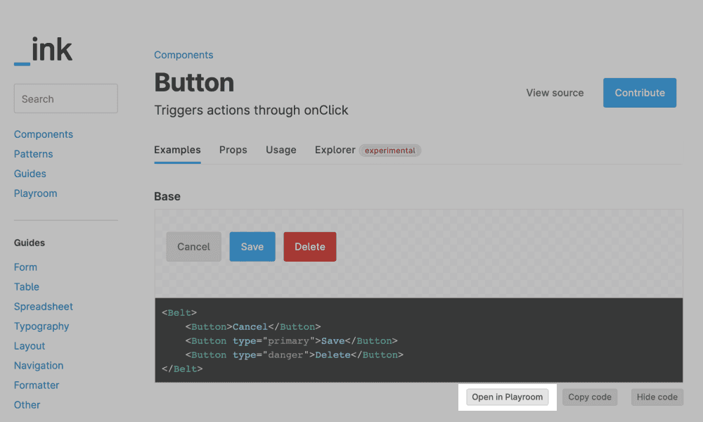
Open in playroom from examples
All the example code snippets we display within our component documentation can be opened in playroom.
Autosave
The Playroom editor remembers your last prototype in each browser respectively excluding incognito mode. It saves to local storage as you edit.
Local playroom
If you have the ink repo and desire to use it locally, run yarn playroom from the root.
TypeScript support not available
We don't currently support it within Playroom but if code is copied to a traditional code editor that has TypeScript support, it will have the valid warnings and error messages.
Is this page helpful?
